Aspect-ratio
Aspect-ratio utilities for media elements with module mixins for responsive modifiers.
Utilities (anchor)
See the examples below to view how single and child element ratios work.
| Utility name | Property values |
|---|---|
| Single ratios | |
| .ratio | aspect-ratio: var(--ratio) |
| .ratio-auto | aspect-ratio: auto |
| .ratio-1x1 | aspect-ratio: 1 / 1 |
| .ratio-16x9 | aspect-ratio: 16 / 9 |
| .ratio-5x2 | aspect-ratio: 5 / 2 |
| .ratio-4x1 | aspect-ratio: 4 / 1 |
| .ratio-3x4 | aspect-ratio: 3 / 4 |
| .ratio-4x6 | aspect-ratio: 4 / 6 |
| Child ratios | |
| .child-ratio | aspect-ratio: var(--ratio) |
| .child-ratio-auto | aspect-ratio: auto |
| .child-ratio-1x1 | aspect-ratio: 1 / 1 |
| .child-ratio-16x9 | aspect-ratio: 16 / 9 |
| .child-ratio-5x2 | aspect-ratio: 5 / 2 |
| .child-ratio-4x1 | aspect-ratio: 4 / 1 |
| .child-ratio-3x4 | aspect-ratio: 3 / 4 |
| .child-ratio-4x6 | aspect-ratio: 4 / 6 |
Responsive mixins (anchor)
Responsive modifier mixins are provided to include where required in custom breakpoints, the utilities available use the following modifier class naming convention:
.ratio-16x9
.ratio-16x9-xxl
.ratio-16x9-xl
.ratio-16x9-lg
.ratio-16x9-md
.ratio-16x9-sm
.ratio-16x9-xs
.ratio-16x9-xxs
Examples (anchor)
Aspect-ratio properties work best with images or other media content but can be used with any content with preset block or inline size values. All the image examples below use the object-fit: cover property utility provided by the optional object-fit styles to clip the image to retain their original aspect-ratio.
Single elements (anchor)
.ratio-4x6
.ratio-3x4
.ratio-auto
.ratio-1x1
.ratio-16x9
.ratio-5x2
.ratio-4x1
Example HTML
The <div> is not required, it's only used to contain the code examples with the images.
<div>
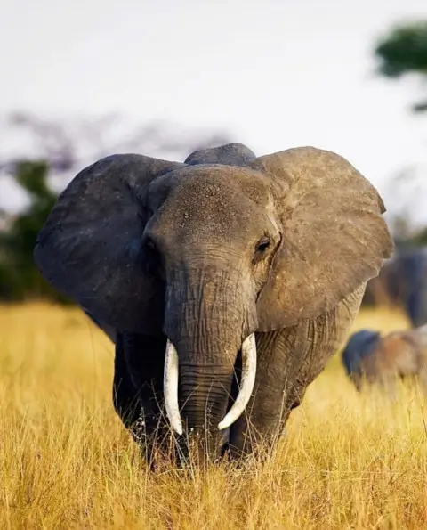
<img src="/img/elephant-480.webp" class="object-cover ratio-4x6" alt="Head on shot of elephant with big tusks and ears flared staring down camera" width="200">
<code>.ratio-4x6</code>
</div>
<div>
<img src="/img/elephant-480.webp" class="object-cover ratio-3x4" alt="Head on shot of elephant with big tusks and ears flared staring down camera" width="200">
<code>.ratio-3x4</code>
</div>
<div>
<img src="/img/elephant-480.webp" class="object-cover ratio-auto" alt="Head on shot of elephant with big tusks and ears flared staring down camera" width="200">
<code>.ratio-auto</code>
</div>
<div>
<img src="/img/elephant-480.webp" class="object-cover ratio-1x1" alt="Head on shot of elephant with big tusks and ears flared staring down camera" width="200">
<code>.ratio-1x1</code>
</div>
<div>
<img src="/img/elephant-480.webp" class="object-cover ratio-16x9" alt="Head on shot of elephant with big tusks and ears flared staring down camera" width="200">
<code>.ratio-16x9</code>
</div>
<div>
<img src="/img/elephant-480.webp" class="object-cover ratio-5x2" alt="Head on shot of elephant with big tusks and ears flared staring down camera" width="200">
<code>.ratio-5x2</code>
</div>
<div>
<img src="/img/elephant-480.webp" class="object-cover ratio-4x1" alt="Head on shot of elephant with big tusks and ears flared staring down camera" width="200">
<code>.ratio-4x1</code>
</div>Child ratios (anchor)
The .child-ratio-* utilities are applied to a container class so all child elements use the aspect-ratio being provided, the optional object-fit styles also include .child-object-* utilities to use with the ratios if required.
Useful for a gallery, the following uses the grid and gaps utilities to contain the images within a responsive grid.


Example HTML
<div class="child-object-cover child-ratio-1x1 grid-columns g-2-xs g-4 gap-3 mb-3">
<img src="/img/rocky-stream-480.webp" alt="A rocky stream next to a small copse of pinetrees on a grassy bank" width="400">
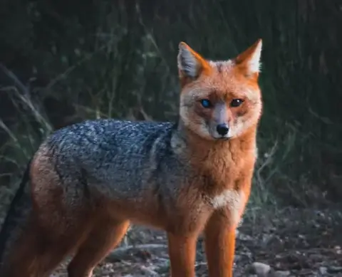
<img src="/img/red-fox-480.webp" alt="A red fox with one eye blue and the other brown looking directly at camera" width="400">
<img src="/img/hazy-mountains-480.webp" alt="View of distant mountains and valleys scenery bathed in hazy sunlight" width="400">
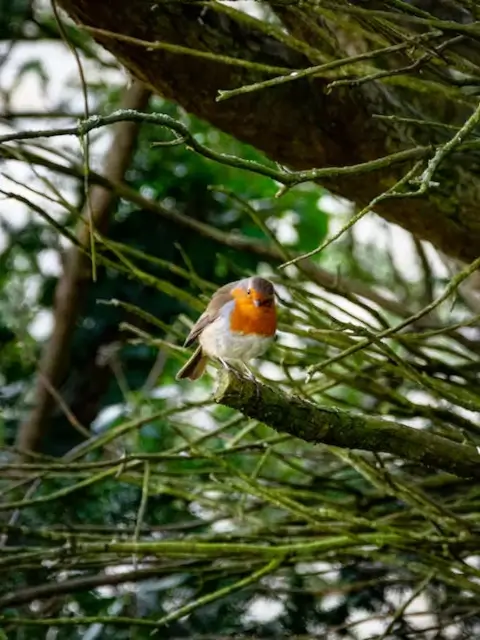
<img src="/img/bird-on-branch-480.webp" alt="A small white and brown bird with orange chest colors sitting on a tree branch" width="400">
</div>Applied to a <figure> element that also includes a <figcaption> with the image (above or below).

Example HTML
<figure class="child-ratio-16x9 child-object-cover">
<img src="/img/winter-forest-300.webp" alt="Snowy forest clearing with sunlight filtering through tall trees" width="300">
<figcaption>Winter forest 16x9</figcaption>
</figure>

<figure class="child-ratio-5x2 child-object-cover">
<img src="/img/winter-forest-300.webp" alt="Snowy forest clearing with sunlight filtering through tall trees" width="300">
<figcaption>Winter forest 5x2</figcaption>
</figure>

<figure class="child-ratio-4x1 child-object-cover">
<img src="/img/winter-forest-300.webp" alt="Snowy forest clearing with sunlight filtering through tall trees" width="300">
<figcaption>Winter forest 4x1</figcaption>
</figure>
Inline ratios (anchor)
Custom aspect-ratios can also be included using inline styles with a variable utility class for creating custom aspect-ratios.
For single elements the .ratio class is used:

Example HTML
<img src="/img/desert-480.webp" alt="Desert sand dunes with blue sky background" width="300" class="object-cover ratio" style="--ratio: 15 / 7;">
<img src="/img/desert-480.webp" alt="Desert sand dunes with blue sky background" width="300" class="object-cover ratio" style="--ratio: 15 / 6;">
<img src="/img/desert-480.webp" alt="Desert sand dunes with blue sky background" width="300" class="object-cover ratio" style="--ratio: 15 / 5;">
For child elements the .child-ratio class is used:
Example HTML
<div class="child-ratio child-object-cover grid-columns g-2-xs g-4 gap-3 mb-3" style="--ratio: 15 / 7">
<img src="/img/elephant-480.webp" alt="Head on shot of elephant with big tusks and ears flared staring down camera" width="400">
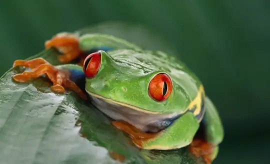
<img src="/img/frog-540.webp" alt="Close up of green frog sitting on leaf of tree." width="400">
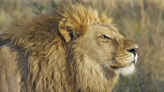
<img src="/img/lion-540.webp" alt="Male lion with healthy main staring into distance." width="400">
<img src="/img/red-fox-480.webp" alt="A red fox with one eye blue and the other brown looking directly at camera" width="400">
</div>Using the module (anchor)
Load StyleMods as demonstrated (change file path as required) then include the Sass mixin anywhere below.
@use "stylemods/scss" as *;
@include aspect-ratio-css;

// Example breakpoint
@media (width < 480px) {
  @include aspect-ratio-sm-css;
}
See the using modules page for more information.
Using the framework (anchor)
Using the recommended custom setup enable the styles (and required breakpoints) in an overrides document:
@use "stylemods/scss/configuration" as *;
$enable-aspect-ratio:     true;
$enable-aspect-ratio-sm:  true;
Include the overrides and the framework styles with your custom document for compiling the framework:
@use "overrides";
@use "stylemods/scss/stylemods";
See using the framework for more information.
Source code (anchor)
The Aspect-ratio source file is included with the layout module files, you can view the source code from the latest release (v1.5.0) via the Github link below.
- Source document
- stylemods/scss/layout/aspect-ratio.scss
- View on Github
- https://github.com/pmbrown/StyleMods/blob/main/scss/layout/aspect-ratio.scss
Shared documentation about how to customize the default property values for the styles using the Sass and CSS variables is provided on the customizing page.